KEA ELISA
Visual identity shaped by intuition, presence, and inner energy.
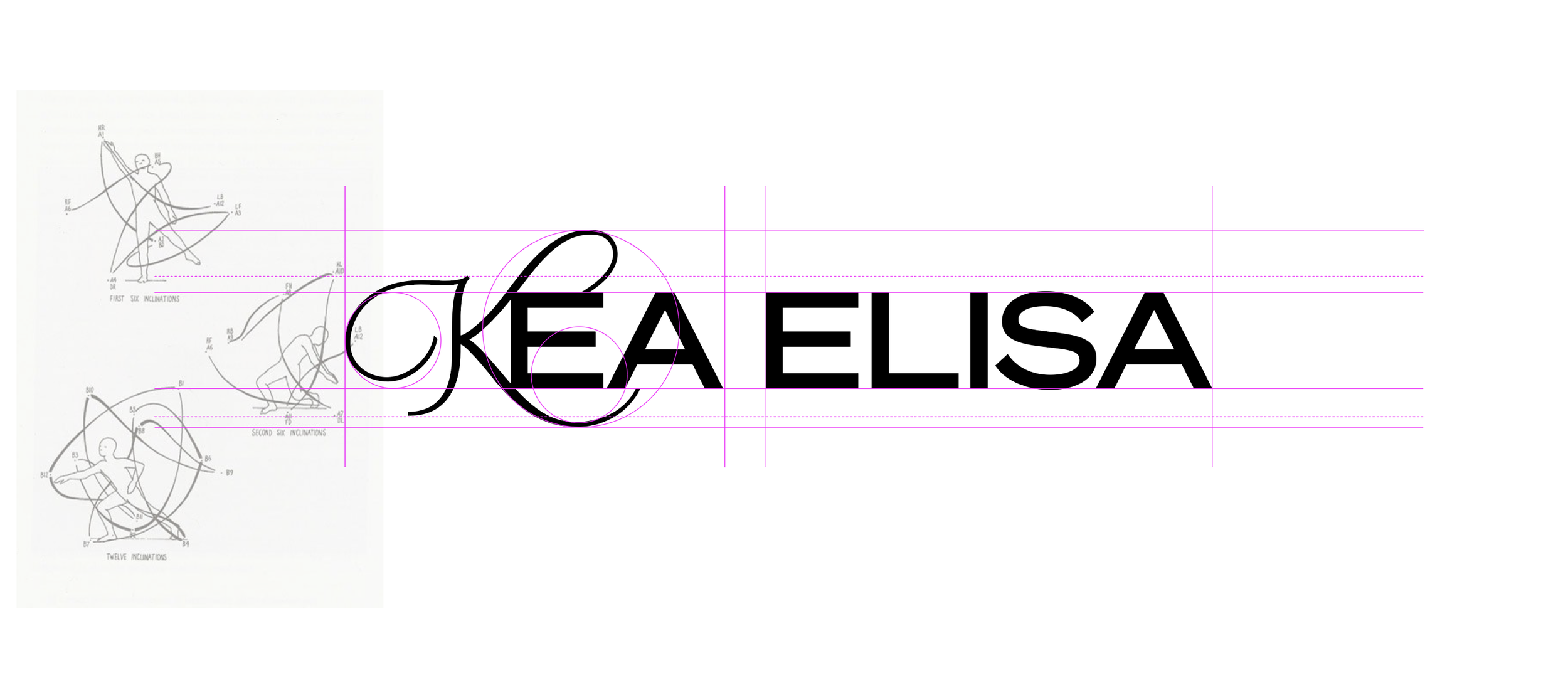
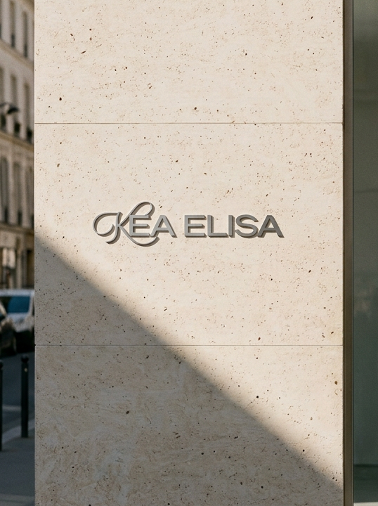
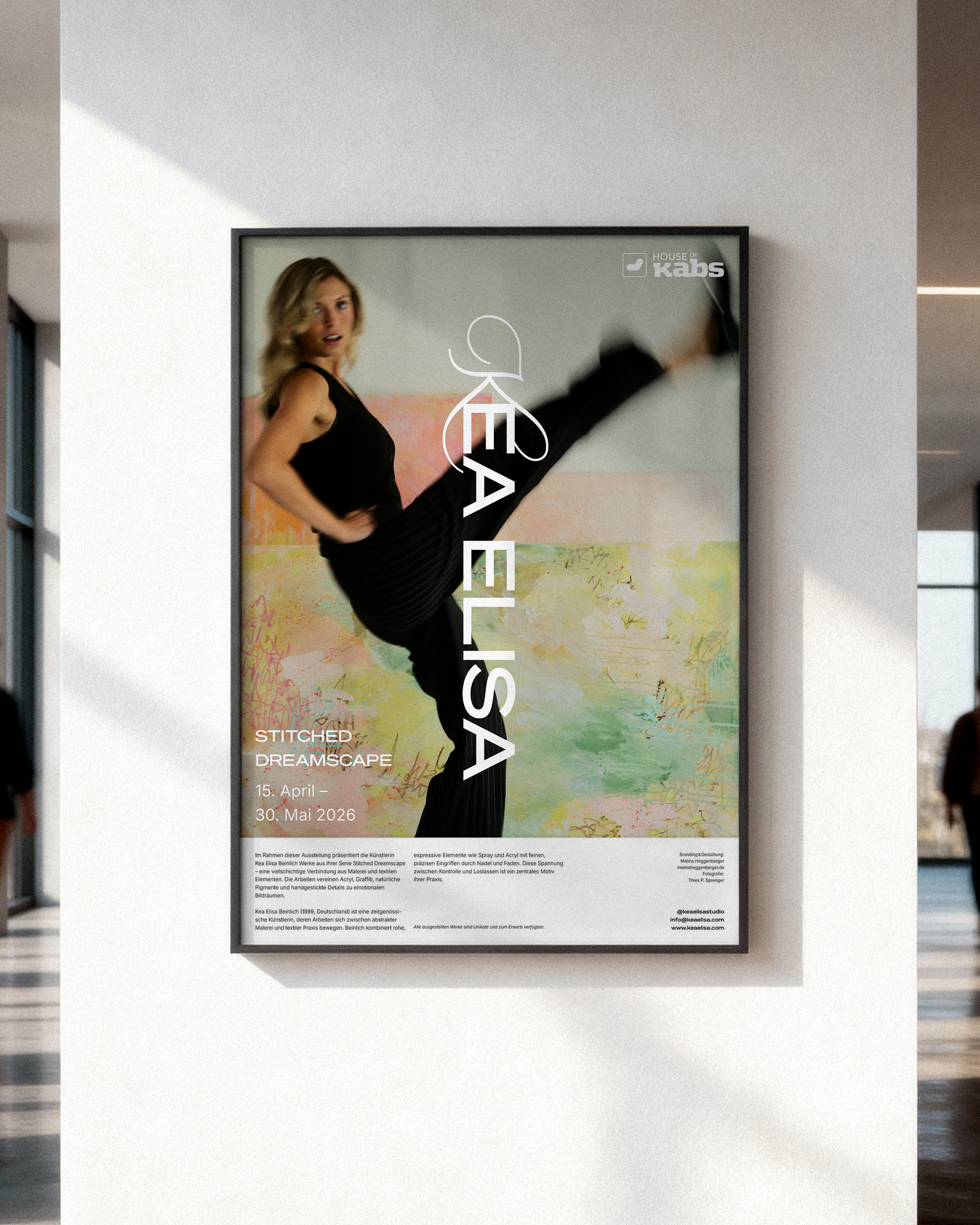
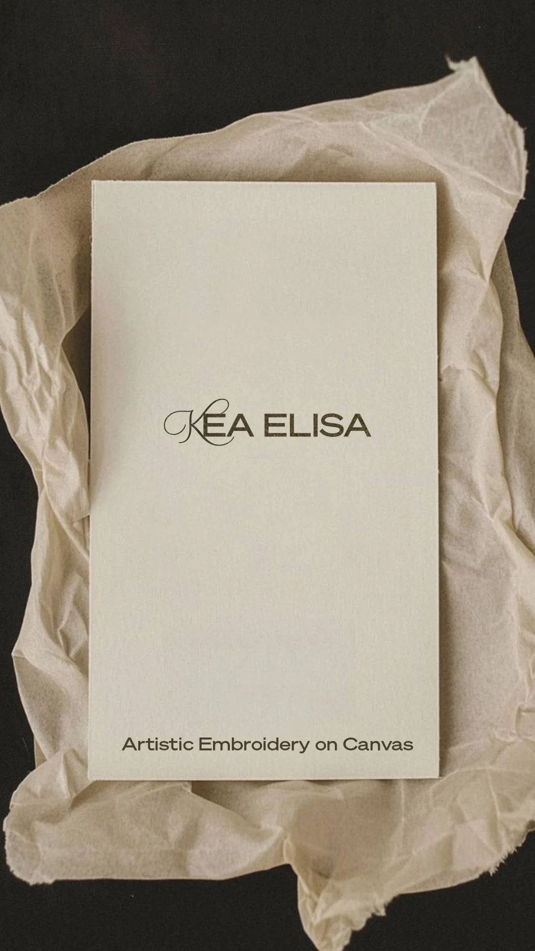
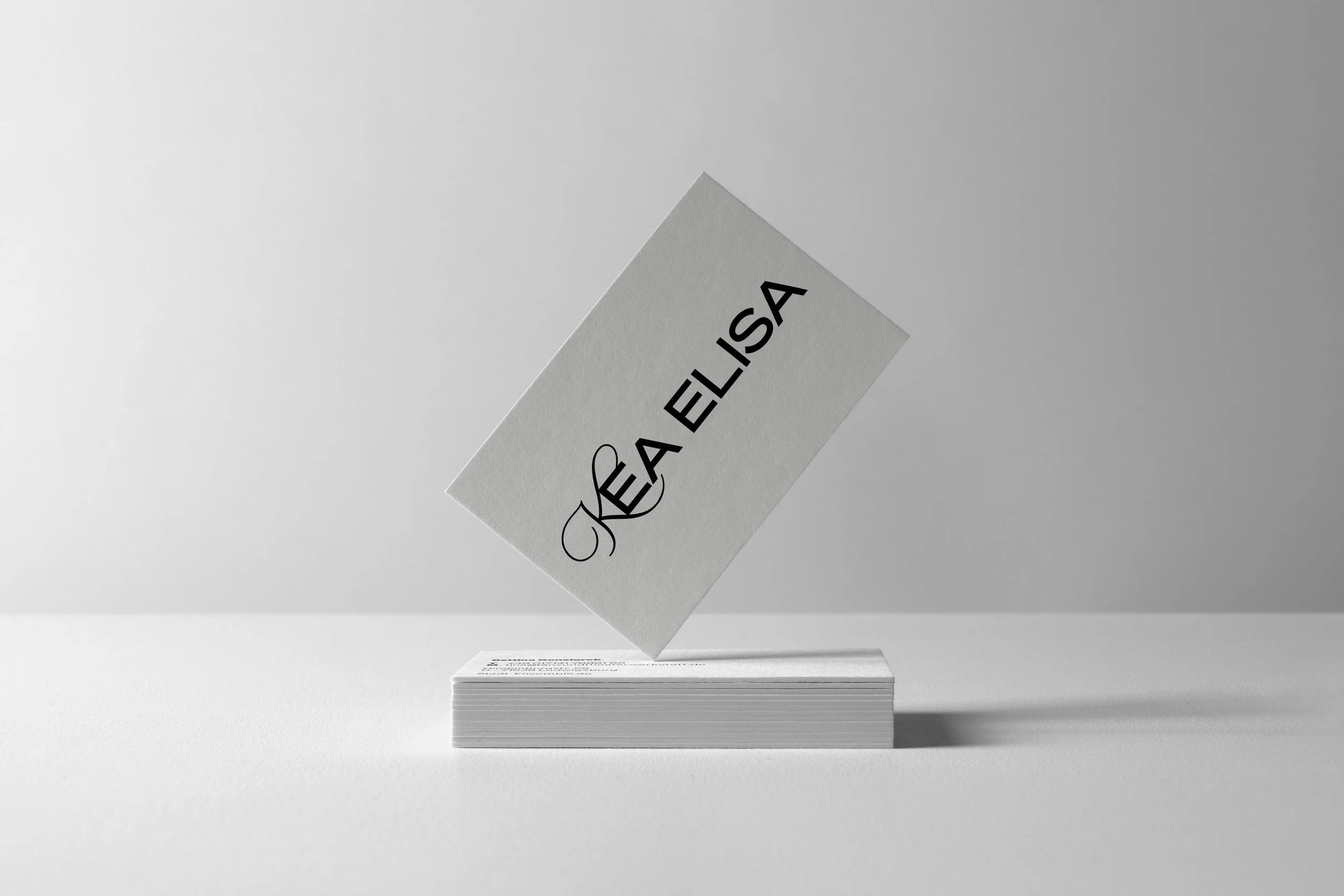
The identity for Kea Elisa translates artistic process into a living visual system. At its core, the “K” acts as a point of origin — a gesture drawn in motion, capturing transformation rather than fixed form.
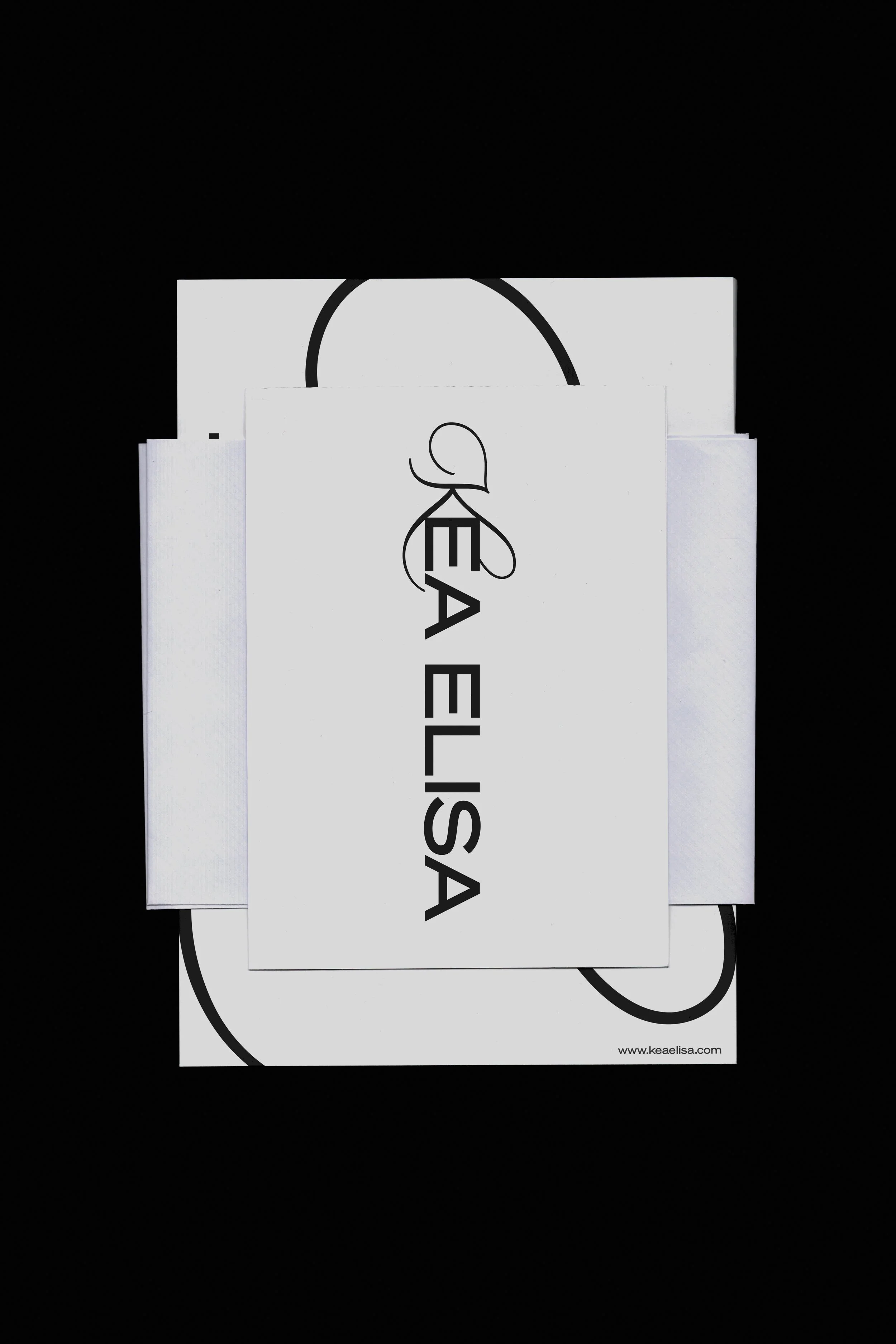
“EA ELISA” in Söhne by Klim Type Foundry establishes a structured counterpoint. Precision meets fluidity, creating a tension between control and intuition that reflects her artistic practice between painting and textile work.
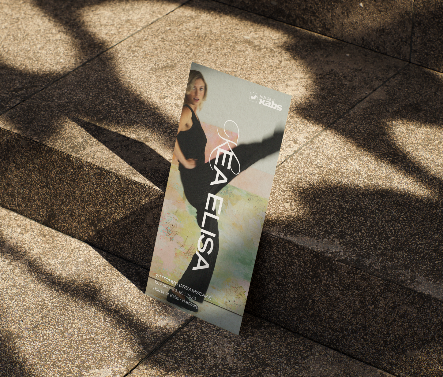
The system is not static but responsive — an identity that behaves like the practice itself: layered, expressive, and in constant becoming.
Kunde
KEA ELISA
BRAND IDENTITY